
Synthia 发布
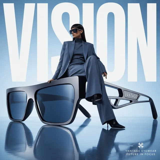
前卫眼镜时尚广告
产品营销 · 海报 / 传单 · 摄影 · 赛博朋克 / 科幻
51616.4k
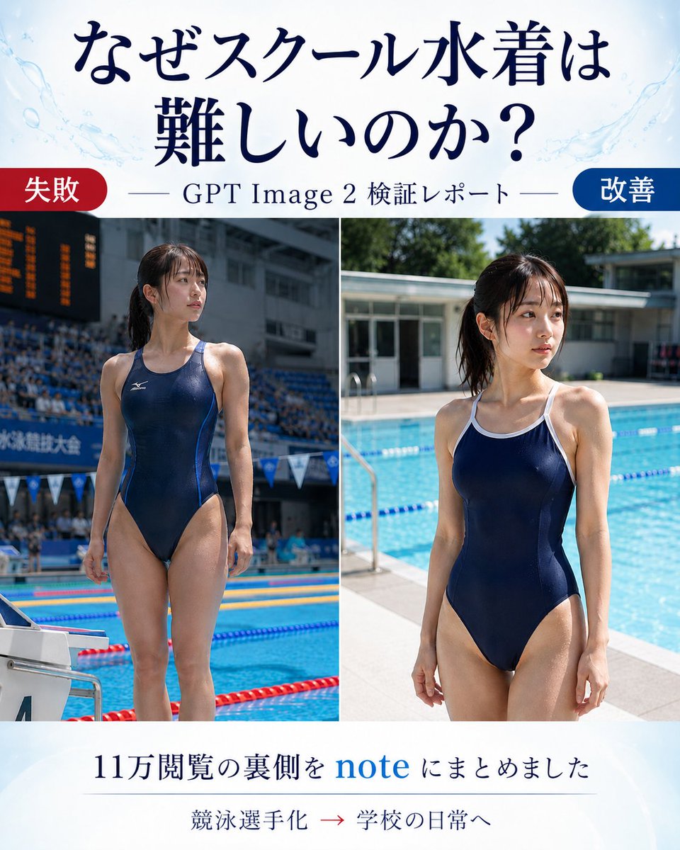
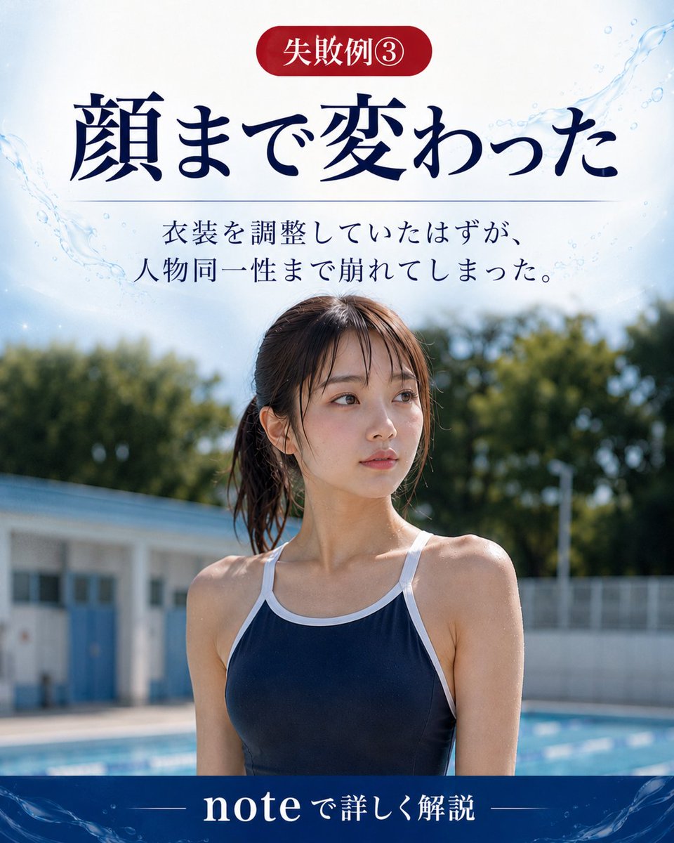
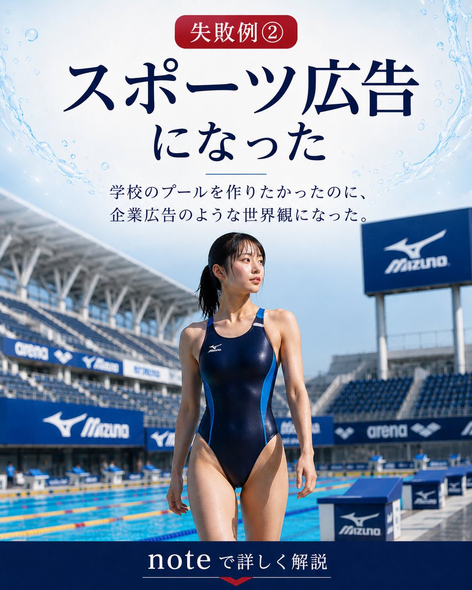
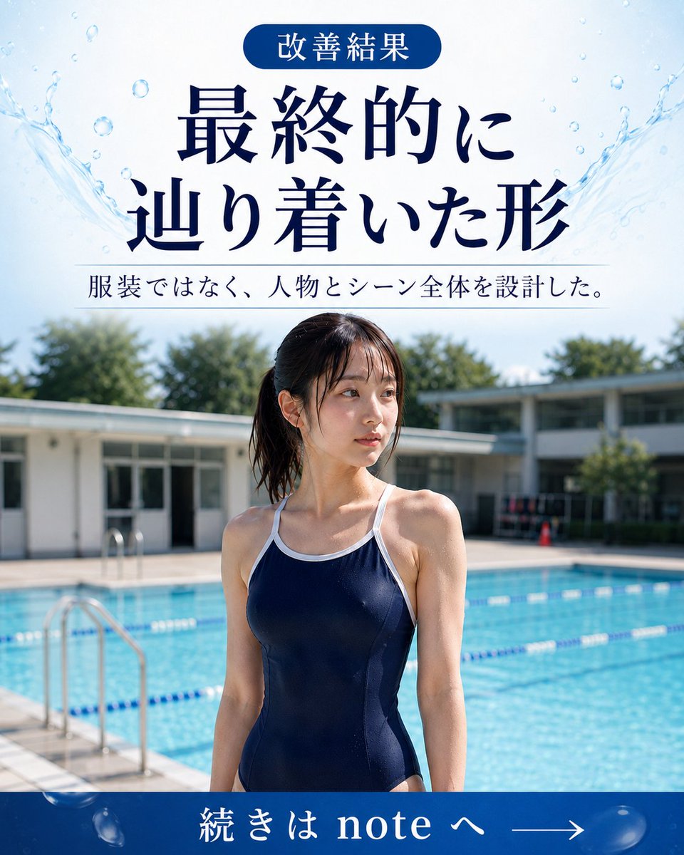
Creates a Japanese before-and-after article thumbnail comparing a failed competitive-swimmer result with an improved school-pool daily-life result.
完整提示词,可直接复制或调整。
Goal: Create a vertical Japanese promotional comparison poster for an article about why generating a school swimsuit is difficult in GPT Image 2, showing a before/after visual test report.

Canvas: Portrait 4:5 layout, clean editorial blog-thumbnail design, white background with pale blue watercolor splashes and subtle pool-water motifs near the top corners. Use elegant dark navy Japanese serif typography.

Header: Large centered headline text in Japanese: 「なぜスクール水着は 難しいのか?」 with the line break after 「は」. Below it, add a thin horizontal rule on both sides of the subtitle 「GPT Image 2 検証レポート」.

Main layout: Two large side-by-side photo panels separated by a thin white vertical divider. Use exactly 2 comparison images: left panel labeled as failure, right panel labeled as improvement. At the top-left of the image area, place a rounded red pill label reading 「失敗」. At the top-right, place a rounded blue pill label reading 「改善」.

Left photo panel: A realistic full-body poolside photo of an adult woman in a navy one-piece competitive racing swimsuit, standing at an indoor or stadium-like competition pool. Make it look like a sports meet or swimming competition: spectator stands, scoreboard, lane ropes, starting block, and official competition atmosphere. Her face should be intentionally obscured with a rectangular blur/mosaic block. The pose is upright and athletic, emphasizing that the generation became too much like a competitive swimmer.

Right photo panel: A realistic full-body poolside photo of an adult woman in a navy one-piece school-style swimsuit with white trim and shoulder straps, standing beside a bright outdoor school pool in daylight. Background includes blue pool water, lane ropes, pool deck, low school-building architecture, and greenery. Her face should also be intentionally obscured with a rectangular blur/mosaic block. The mood is casual school daily life rather than sports advertising.

Footer: Centered Japanese text in dark navy: 「11万閲覧の裏側を note にまとめました」 with the word “note” in bright blue. Under it, add a small line of text: 「競泳選手化 → 学校の日常へ」 with the arrow in red. Use a faint divider line above the small text.

Visual style: Realistic photography in the two panels, magazine/article cover composition, high contrast between the failed sports-ad look and the improved school-pool daily-life look. Keep the design polished and readable, with no extra logos or watermarks.

Customizable slots: Article headline may be なぜスクール水着は難しいのか?; subtitle may be GPT Image 2 検証レポート; left label may be 失敗; right label may be 改善; footer text may be 11万閲覧の裏側を note にまとめました.
来自相同模型和分类的相关提示词。
Synthia 发布
产品营销 · 海报 / 传单 · 摄影 · 赛博朋克 / 科幻
Anissa 发布
海报 / 传单 · 产品营销 · 摄影 · 极简主义
Aijaz 发布
产品营销 · 海报 / 传单 · 摄影 · 极简主义
Noor 发布
产品营销 · 海报 / 传单 · 摄影 · 极简主义
Lariab Fatima 发布
海报 / 传单 · 产品营销 · 摄影 · 电影感 / 电影剧照
𝗦𝗮𝗻𝗶𝗮 发布
产品营销 · 海报 / 传单 · 摄影 · 极简主义